
Overview
A Branding redesign and advertising campaign focused on an american-based airlines.
The Problem
American Airlines is a legacy brand that is reliable & patriotic. The current branding does not reflect these ideals. American Airlines needs to be the one and only all American airline.
The Solution
Refresh the airline with a rebranding campaign that draws from one of their previous logos, highlighting its American spirit.
PROJECT
American Airlines
TEAM
Steven Pereira, Keishlyan Carrero Detres
ROLE
Art Direction
TOOLS
Figma, Illustrator, After Effects
C: 92% M: 68% Y: 12% K 1%
C: 75% M: 68% Y: 67% K: 90%
C: 0% M: 0% Y: 0% K: 0%
R: 34 G: 92 B: 154
R: 0 G: 0 B: 0
R: 255 G: 255 B: 255
Pantone P 105-7 C
Pantone P Process Black C
Pantone P 179-1 C
#225C9A
#000000
#FFFFFF
C: 6% M: 100% Y: 100% K: 1%
R: 224 G: 22 B: 25
Pantone P 48-8 C
#E01619
Aa
ABCDEFGHIJKLMNOPQRSTUVWXYZ
abcdefghijklmnopqrstuvwxyz
Owners Bold
THE LOGO
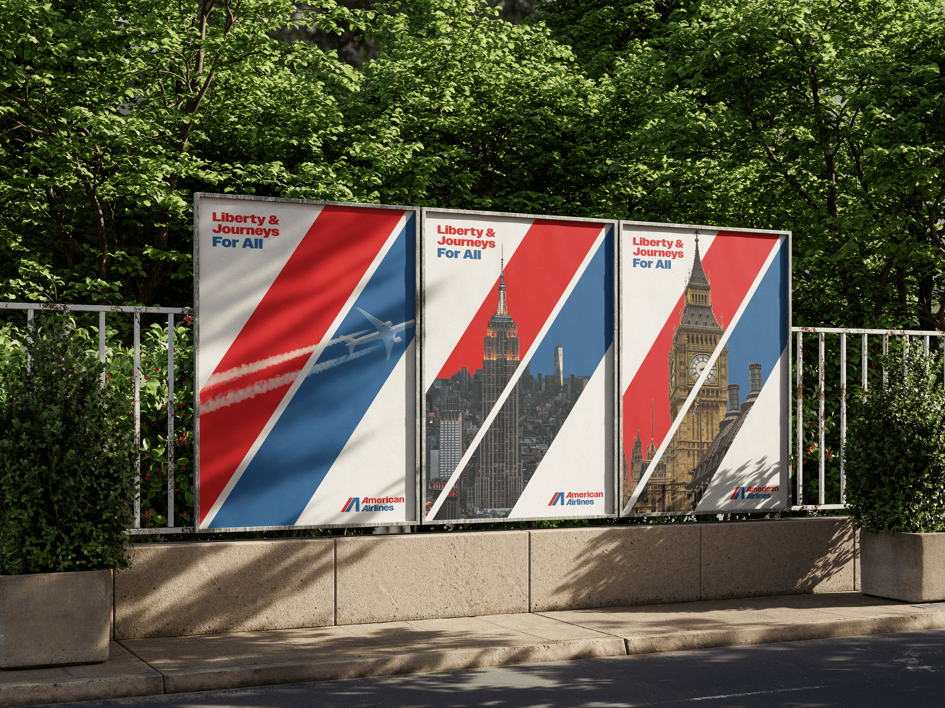
The main logo is an evolution of American Airlines’ 1967 logo. The angles showcased in the symbol and the A’s in the logotype are meant to embody a sense of travel and movement. The colors red and blue are meant to symbolize the pride of American Airlines has in the United States.
BRAND COLORS
Color is an important part of the AA brand. The colors are inspired by the American flag and it’s meaning. Red symbolizes hardiness, valor, and strength. White symbolizes purity, innocence, and the body of our planes, and blue represents vigilance, perseverance, justice and the sky.
TYPEFACE
Owners Bold is a strong, modern typeface that exudes confidence and reliability, essential for an airline as iconic as American Airlines. The typeface’s contemporary yet timeless feel aligns with American Airlines’ commitment to innovation while respecting its rich heritage. Owners Bold also conveys a sense of authority and trust, making it ideal for an airline that prioritizes safety, efficiency, and a seamless travel experience.
The main logo is an evolution of American Airlines’ 1967 logo. The angles showcased in the symbol and the A’s in the logotype are meant to embody a sense of travel and movement. The colors red and blue are meant to symbolize the pride of American Airlines has in the United States.
The horizontal logo should be used sparingly in cases where the main logo does not fit in within the design in a cohesive manner.
Logotype
Symbol
Horizontal logo
Logo
0.5 in
1 in
Minimum Size
Clear Space & Minimum Size
The minimum size for screen applications is 96 pixels by 219 pixels, while for print applications, it measures 0.5 inch by 1 inch. Avoid using the logo at sizes smaller than the specified dimensions.
Do not
change the color of the logo
Do not
invert the colors of the logo
Do not
stretch the logo
Do not
place the logo on colored
backgrounds with low contrast
Incorrect Logo Usage
What sets American Airlines apart from other American-based airlines is the personality they bring to the flight experience. AA always strives to showcase their pride in being American, as well as making the journey from the airport to the planes a relaxing experience for all.
Whether you’re a business-class traveler or looking to fly to a new vacation destination with your family, American Airlines hopes to embody these traits throughout your experience flying with us.
Proud
Dependable
Easygoing
Experienced
Brand Personality
Typeface
A-Z Regular, 40
A-Z Black, 40
DIGITS, REGULAR, 40
MATH, REGULAR, 40
SYMBOLS, REGULAR, 40
PUNCTUATION, REGULAR, 40
1234567890
ABCDEFGHIJKLMNOÖPQRSTUVWXYZabcdefghijklmnopqrstuvwxyzåäæñöøé
Owners
ABCDEFGHIJKLMNOÖPQRSTUVWXYZabcdefghijklmnopqrstuvwxyzåäæñöøé
{}[]()!?.:;,“”~-–—
@#$%&*®©←↑→↓∞⌘
+-×÷±=≠≈<>≤≥
The typeface used throughout American Airlines’ brand experience is Owners. This type is used in any place where type is used, from our logo to headlines to body copy. Headlines are typically written in either Owner Bold or Black, while body copy is always written in Owners Regular.
Color
Color is an important part of the AA brand. The colors are inspired by the American flag and it’s meaning. Red symbolizes hardiness, valor, and strength. White symbolizes purity, innocence, and the body of our planes, and blue represents vigilance, perseverance, justice and the sky.
C: 92% M: 68% Y: 12% K 1%
C: 6% M: 100% Y: 100% K: 1%
C: 75% M: 68% Y: 67% K: 90%
C: 0% M: 0% Y: 0% K: 0%
R: 34 G: 92 B: 154
R: 224 G: 22 B: 25
R: 0 G: 0 B: 0
R: 255 G: 255 B: 255
Pantone P 105-7 C
Pantone P 48-8 C
Pantone P Process Black C
Pantone P 179-1 C
#225C9A
#E01619
#000000
#FFFFFF
Color Usage
Do not
Mix the colors
Do
Use white between colors
Do not
Mess with proportions
Do
Keep similar proportions
Do
Pair with white
Do not
Use other colors
Do not
Use colored text
Do
Use white text
AA
AA
AA
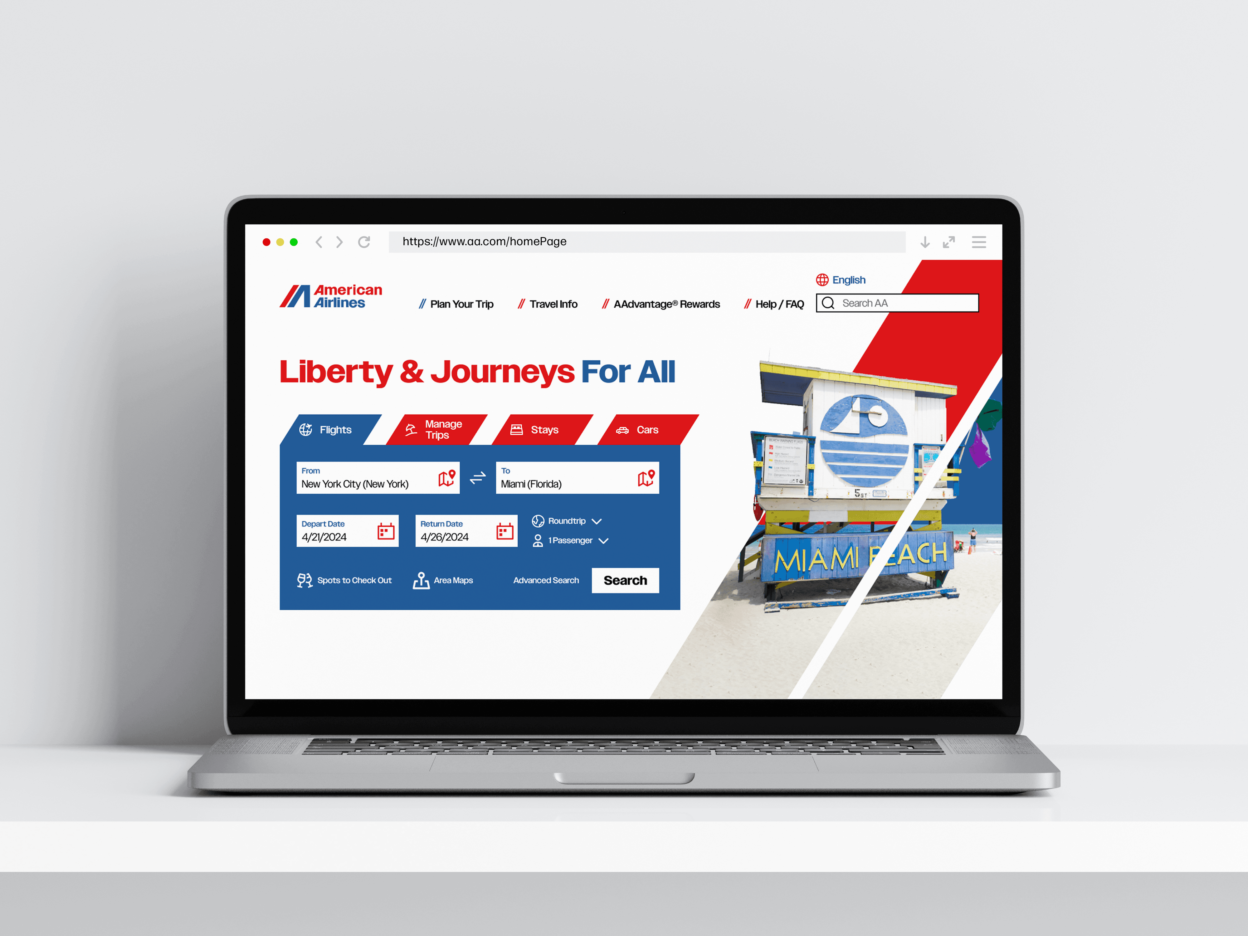
American Airlines
When writing out our name in text and other forms of writing, you can either write it using our full name, American Airlines, or abbreviate it to just AA. No matter which way you write our name in text, you must make sure that both A’s in our name are capitalized.
How to Write Our Name in Text
Correct Logo Usage
Our logo is versatile, being able to be used on top of the various colors within American Airlines’ color palette. When used on top of a solid color other than white, the logo’s colors should be changed to be all white. When used against a solid white background, our main logo can either be used as is or if the design calls for it, the logo’s colors can be changed to the various colors in our color palette.

Through redefining the airline with a new brand identity and purpose, American Airlines can fly towards the future of the airline industry while offering all of customers effortless traveling experiences throughout America and beyond.
WHAT I LEARNED